Monday, October 20, 2008

WORK SHOP THREE - DRAWING

Drawing was the final workshop I attended, initially I had planned to undertake the Architecture in Motion workshop to finish the semester. After the lecture about Drawing a few weeks ago I concluded that it was a workshop that would be instantly useful in design and other subjects and therefore could not be missed.


After completing the workshop I definitely feel I am better equipped to both understand architectural drawings and produce my own for presentations and quick sketching.


The various concepts and methods of drawing that we were introduced to I found especially interesting. The differences between the presentation images of MVRDV or Koolhaus and more traditional architects such as Wright highlighted to me the freedom we have in communicating our ideas. While I have learned about the broad range of methods and materials we can utilize I have also enhanced my understanding of the overall quality and care in presentation that is required regardless of the method used.

In my final project I decided to concentrate on the spatial relationships within the Botta house, inparticular the way spaces are organised around the large open outdoor terrace. I wanted to produce a series of 3ds that included section cutaways that would reveal this in a way that was easier to understand than in a simple 2d section. I located a simple massing model of the building on the interweb and after a series of format conversions got it into SketchUp. I then corrected some proportion issues in the model and added internal divisions and the two main windows. I then spent some time deciding which angels and section cuts to use before exporting them as vector drawings. These I then cleaned up and simplified, then sized appropriatly before carefully tracing them off the screen. Once I had extracted the 4 3ds off the screen I had to refine inconsistencies add people, and also add some light colour for the background that would link the images and also make windows easier to read.

WORK SHOP TWO - FLUID THOUGHTS TO ACTIONS

The name of this workshop is what initially attracted me to it, I was interested in how one could illustrate the feel or experience of a complex form or space though drawing.


We began the workshop on a chilly day out at the opera house. Using charcoal for the first time since high school was at points extremely frustrating. However as the day went on I began to get more enjoyment out of the exercise and understand the building better. We would move postions every now and then and therefore needed to try to successfully integrate this motion into our drawings. This I found especially frustrating.


Over the 4 weeks that this workshop ran we undertook a range of exorcises, mainly working with charcoal. We did a couple of group drawings, where we connected our own drawings together to form a whole. However this was the most frustrating of all the exorcised for me. I found it hard to understand the purposed behind the almost arbitrary way that we joined imaged together. The final compositions we created were entirely new images, some I thought were quite spectacular, however most had very little relation to the original 'thoughts' and were instead totally abstract artworks that perhaps could suggest architectural space, but a unintentional space generated from the act of combining images. I found this exorcise could be useful to brainstorm ideas and produce a concept, but I did not learn new ways to communicate a fluid thought I might be having.


Overall I had a mixed response to this workshop. I thoroughly enjoyed the development of our charcoal drawing skills through these exorcises and the useful tips and advice that we were given that will enhance our future drawing skills. The main thing about the workshop that I did not like was that I thought the exorcises (excluding the Opera House) were primarily aimed at advancing our skills in general and I did not learn specifically how best to apply these in architectural communication.

WORK SHOP ONE - MATERIAL MODELING

Material Modeling was the first workshop that I attended. It coincided well with the balsa model that was required for design this semester. Prior to this workshop I had very little experience with model making. I thought the initial exorcises were fantastic as it showed the degree of precision that is required to achieve the clean aesthetic of professional models. I was amazed by the 1:1 models of objects we produced and their success in imitating the form and identity of those objects very simply.


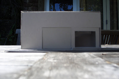
For the main task we had to essentially remodel our bedrooms. I had a hard time deciding what I would do as my bedroom was slightly problematic to model. My room is entirely underneath a cliff or large rock and has no visible external walls aside from the front windows/door. The large rock actually makes up the wall of my bathroom.


For the model I decided I would celebrate this section of visible rock by revealing it entirely and moving the bathroom. I also extended my room outward and sidewards from the rock to lesson the cave like nature of the space.


Overall I found this workshop to be, along with Drawing, invaluable. I constantly use techniques and methods that I was taught in the workshop, and the skills I began to develop have evolved and improved.

Sunday, June 22, 2008

Final Model

Final - http://www.zshare.net/download/140678700b144d79/

Final with fixed movers- http://www.zshare.net/download/141767577458f597/


Draft 1 - http://www.zshare.net/download/1406817836aaf1f9/

Draft 2 - http://www.zshare.net/download/1406805063d9afac/


notes for exploring model:
-Type "suicide" into console to respawn at all the various starting points.
-The Apple elevator disappears for some reason behind glass and is hard to find because of this. You can trigger it at any of the elevator doors, just wait a second for it to arrive. Don't trigger both elevators to arrive together because they go to the same place and will crash.
-There are some sliding doors that you need to run into to open.
-The stairs don't meet hand rail regulations and are probably quite deadly.


The bridge is located between two existing office buildings. These could house the rest of the Versace or Apple offices. The exterior form of the building and its unique location is primary way the power of Jobs and Versace is represented. Viewed from any location the building intends to make a statement that the two companies, and individuals in charge, are at the forefront of their industries, in a class above their comp editors and surrounding businesses. The upper offices located within my building are the offices of Donatella Versace and Steve Jobs, and any of their assistants and close advisers. Although both companies are very different in their product areas and design philosophies, they both strive to continuously impress their customers with new and exciting products. In order to do this they require many people to be devoted to coming up with, and developing new designs/ideas. The offices and work space in the lower half of the building are intended for those employees that are dedicated to this department. The foliage that covers the majority of the buildings exterior is supposed to give the impression that the work being done inside is somewhat secretive. Because each of the companies offices are divided in two, there are also two entrances for each company; one exclusively for those working in Jobs’ office or Donatella’s office, and another for those employees hard at work developing ideas and designs. The entrance for Job’s/Donatella’s offices looks out over the interior of the building, reminding them of the power they hold in their company. The lower entrances do not look out over the buildings interior but instead have a wall with the company logo that reminds them they are part of the company and working for Jobs/Donatella Versace.

table


The dinning area and function room is located at the top of the building because so Jobs and Versace can look downward into their offices. It is also at this location so employees can easily see where the most powerful people in the company get to go. The space is very simple. High windows look outward in all directions, giving views of the city from a position high above a street between two buildings. The form of the space itself is not supposed to be the focus, rather the powerful views both inward and outward. Those inside are given the impression of being high in the clouds, looking down at the common people in the city streets and in the lower offices.

The table is supposed to be able to be used in a number of different configurations. If just Steve Jobs is using the area with a few guest he can sit in the middle seat with everyone else sitting around him. If both Jobs and Versace are using the area at the same time, then they would take the seats at either end, with their guests filling in the middle space, and a couple of empty seats between to the two groups as a buffer. The simple yet irregular forms that make up the table are intended to appeal to both the Apple and Versace aesthetic.

A quick note: there is a room connected to this upper space but on slightly lower level, this is where the kitchen would go. Its intentionally on a lower level so that food is brought up to Jobs and Donatella as well as their guests.

apple


The two levels below the dinning area are devoted to the personal offices of Jobs and Versace. Jobs has his own personal area, as well as other space for assistants, secretaries and advisers who would work along side him.


The elevator Jobs uses is styled to fit along side other Apple products. It’s an efficient practical elevator, with 3 glass walls and one metallic. It is designed to allow views of the building interior and the city outside.

versace


Donatella Versace has a similar setup, with her own space and then other areas for assistants ect.


The elevator for Versace has a more complex form than the Apple one; this is so Donatella can ensure attention is on her when traveling in the elevator.

shared


The lower levels have areas that are shared between the two companies, or are located within the same space but separated by railings. These are intended to be primarily social areas, where employees from Versace and Apple, who are working in similar departments of their company, but on completely different projects, can meet, chat, discuss work ect.


textures
linear - rotational
scalar - turbulent
slow - fast